Saga Education Recruitment
Saga Education’s mission is to transform public education and improve outcomes for underserved students. They strive to help accelerate educational equity so every student can imagine and achieve their potential. Saga’s visual style includes several bright colors and a variety of mosaic shapes.
For their 2024 recruitment, our design team decided to step away from Saga's rainbow mosaic motif, and elevate it into a more sophisticated look. Instead of using all 7 brand colors on a single graphic, we limited the color pallet to 2 main colors each. This allowed for diversity among the visuals and wouldn’t overwhelm the audience. Without the overly complex mosaic, it allowed us to play around with motion for visual interest.
Media Cause Team
2023-2024
Project Manager: Stephanie Kong, Alex Smith
Creative Oversight: Erica Baptiste
Designer: Lori Chinn
Copywriter: Jess Schroeder
Client

Social Media
The social media graphics all use animation. We wanted the motions to drive the visual interest. In keeping with Saga's visual aesthetic of a geometric mosaic, we incorporated simple shapes.
For the feed graphics, shapes are used to highlight different parts. The colored highlight animation is used to emphasize the main point while an outlined shape moves around the image to draw your eye.
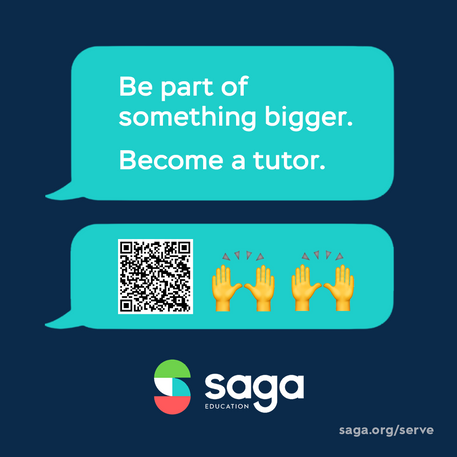
The Instagram story graphics resemble a texting thread. These videos show you texting with someone about joining Saga. To add more visual interest, we incorporated a monochromatic S mosaic background to pay homage to the Saga mosaic.
DOOH Advertising
For the Digital Out of Home advertisments we went with three different visuals. The first one uses more muted colors with a photo and graph icons. The second one is more bright and in your face with the lime green background. It has a pop out photo with small math icons. The third one is a simple texting graphic.


